
Can-do!
It’s been a few summers since we talked about canned wine, but they are here to stay, and as people are looking for different ways to enjoy a tipple, these are part of the mix for relaxing with a “glass” or two.
Among other reasons, the science behind packaging continues to improve, and consumers finally seem ready to acknowledge that some alternative packaging can be a superior way to have some wine handy (I’m looking at you bag-in-box!). Canned wines – without even talking about the juice in the package, are environmentally responsible, easy to recycle, lightweight, and unbreakable. So they are suitable to bring to the backcountry, enjoy in the park (check your local municipality if chilling with wine in the city limits), and even by the poolside or by the water where broken glass can be a serious hazard.
Finally, if the wine in the can is good, it also makes it a little easy to monitor your beverage consumption with a single serving, where at home, I also find them to be a convenient way to have a little wine nearby for a recipe. Though be warned, a 355 mL can of wine is about 2.5 drinks if you are counting and wine might taste a little different directly from the can instead of your typical glassware.
So change things up a little this summer, and I think you’ll be impressed.

Sterling Cabernet Sauvignon, California
Some days you just want a big, splashy red wine after a long day camping. With classic cabernet flavours of cherry, cedar, and bell pepper (but not too much bell pepper), and plenty of tannins for that big meal, this is a solid choice for a variety of occasions. Did I mention that the can is resealable too? Smart thinking. Did I mention that I also dropped this off my desk by accident? I can attest to its durability too.
CSPC +812629, 375 mL $8-9,

Sterling Chardonnay, California
Packaged in a taller, bigger-mouthed can for a slightly more natural wine drinking experience, this is more of the epitome of California chardonnay. Big flavours and creamy oak with great acids bring all the goods for when you need that bigger, oaky chardonnay. The package does make a difference for enjoyment, but you still might want to share with a friend by that campfire.
CSPC +812628, 375 mL $8-9

Lindeman’s 2019 Shiraz, South Eastern Australia
Bring on the fruit! This little fruit bomb is literally, jam-packed with juicy-sweet berry tones, a little spice, and tannins that are so agreeable you barely know they are there. Lindeman’s is well known in our market for making excellent value wines, and remarkably consistent wines too. This would be an easy match for a little firepit or some slightly burned campsite burgers.
CSPC +809971, 250mL $2-3
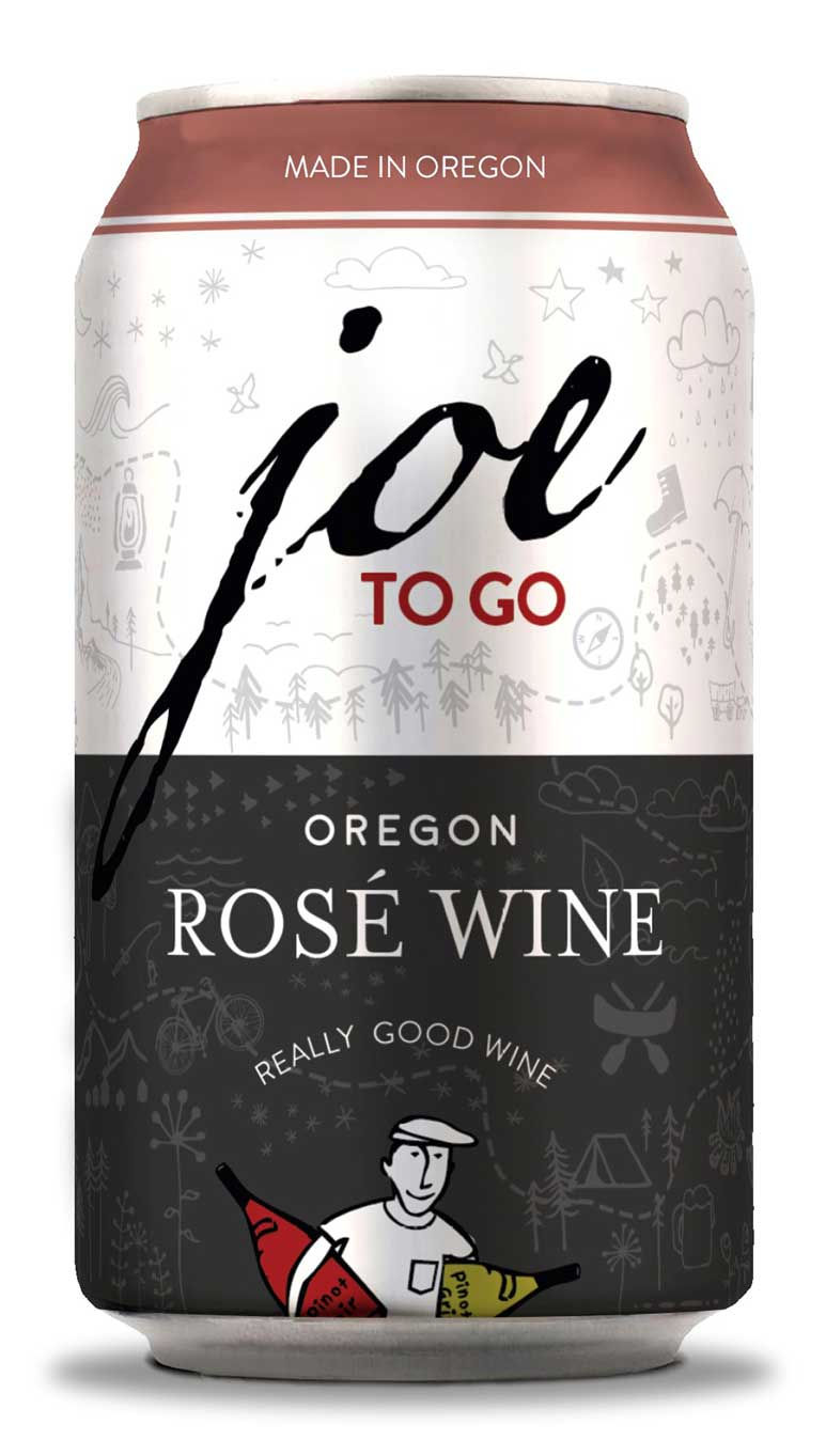
Joe To Go Rosé, Oregon, United States
Anything that gets more wine drinkers trying interesting rosé is a good thing. Joe’s shows of delicate berry fruits on the nose with good expressions and balance on the palate. Quite dry and easy to drink, this sort of rosé ticks off those boxes and makes it very easy to enjoy a couple of glasses of wine at the end of the hike.
CSPC +816138 $11-12

Joe To Go Pinot Gris, Oregon, United States
Pinot gris is well suited to be considered a summer sipper with its juicy, apple fruits, mild pear and nectarine flavours, crisp acids and lighter body. I was very impressed by how well balanced this wine was, and how very refreshing. Weird as it can be drinking wine out of a can, it’s quite a nice treat.
CSPC +816140 $11-12


https://soicauxsmb.com/ bữa thấy bạn bè nhắc mấy lần nên mình cũng bấm vô xem thử cho biết thôi. Mình không đọc sâu đâu, chủ yếu lướt nhanh coi họ làm giao diện ra sao. Ấn tượng đầu là trang nhìn khá gọn, không bị rối mắt, kéo xuống thấy các phần tách khối rõ ràng nên đỡ mệt. Mình cũng thích kiểu họ để thông tin theo dạng bảng/cột, nhìn cái là nắm được ý chính chứ không phải ngồi dò từng dòng. Thanh menu đặt ngay chỗ dễ thấy nên chuyển qua lại cũng nhanh, không cần tìm lâu. Nói chung mới vào vài phút là quen tay vì bố cục dạng khối và mấy bảng số liệu hiển…
97j777 com showed up while I was scrolling through some comments, so I opened it just to get a feel for the page. I didn’t spend long on the actual content, but the layout made sense right away and I wasn’t hunting around for where things were. The navigation feels pretty obvious, and I like that the page doesn’t dump everything on you at once. Stuff is separated in neat little sections, so it’s easy to skim without your eyes bouncing all over the place. It’s not trying to be flashy, just simple and usable, which is honestly all I want when I’m clicking around casually. The way the categories are grouped and shown in clean blocks is what I…
https://vnew88.net/ hôm trước thấy bạn bè nhắc nên mình bấm vào xem thử cho biết thôi. Mình không đọc kỹ nội dung hay ngồi mò từng mục đâu, chủ yếu xem giao diện có dễ nhìn không. Vào cái là thấy trang trình bày khá thoáng, các khối nội dung tách bạch nên lướt nhanh vẫn không bị lạc. Mình thích kiểu họ căn chữ và chia cột gọn gàng, nhìn qua là nắm được thông tin chính chứ không bị dồn chữ rối mắt. Thanh menu cũng nằm chỗ dễ thấy nên chuyển qua lại khá tiện, không phải tìm nhiều. Nói chung cảm giác dùng vài phút là quen tay vì các khung nội dung trên trang được…
Ball88 mình vừa lướt thử cho biết thôi, kiểu xem giao diện có dễ dùng không chứ chưa tính chơi gì. Ấn tượng đầu là trang chia nội dung theo từng mảng nhìn khá thoáng, kéo xuống không bị “ngợp chữ” như vài chỗ khác. Mình có dừng lại ở đoạn giới thiệu, thấy họ để thông tin kiểu bảng nên đọc nhanh được mấy ý cơ bản như thời điểm thành lập với giấy phép, nhìn cũng yên tâm hơn chút. Menu đặt ngay trên nên chuyển mục qua lại khá tiện, không phải mò lâu. Nói chung cảm giác dùng ổn, và cái bảng tiêu chí dạng cột ở phần giới thiệu nhìn gọn, dễ scan trên màn…
88M mình vừa lướt thử vì thấy bạn bè nhắc, kiểu vào xem giao diện ra sao thôi. Ấn tượng đầu là trang đặt tiêu đề “Link đăng ký chính thức 2026” khá nổi, nên người mới nhìn phát biết điểm bắt đầu ở đâu mà không phải mò. Mình không đọc kỹ từng dòng, chỉ kéo xuống xem cách họ trình bày: nội dung chia thành mấy khối gọn gàng, đoạn nói về lịch sử từ 2020 và hành trình 6 năm để riêng nên đọc lướt vẫn hiểu. Font với khoảng trắng nhìn dễ chịu, không bị nhồi chữ như nhiều trang khác. Nói chung cảm giác họ làm để người vào lần đầu đỡ rối, nhất là…